
Usability Stories
Online Reading
Ignore the competition
– http://headrush.typepad.com/creating_passionate_users/2006/07/avoiding_the_fe.html
Featuritis vs. the Happy User Peak
– http://headrush.typepad.com/creating_passionate_users/2005/06/featuritis_vs_t.html
Five Tips for Creating Products With Kick-Butt Design
– http://michael.hightechproductmanagement.com/2006/11/five_tips_for_creating_product.html
Getting Real
– http://gettingreal.37signals.com/toc.php
Illustrated Chronicles of the Portal Plague
– http://blogoscoped.com/archive/2003_08_01_index.html#105972638893532086
Top-10 Application-Design Mistakes
– https://www.nngroup.com/articles/top-10-application-design-mistakes/
Users don’t read anything
– http://www.joelonsoftware.com/uibook/chapters/fog0000000062.html
Best-to-market trumps first-to-market
Best-to-market trumps first-to-market, offering as examples:
– an ergonomic peeler versus a dinky metal peeler
– some clunky MP3 player versus the iPod
– AltaVista? versus Google
Business people accept the need for design, but don’t understand its importance. Best-to-market only happens through craftsmanship.
It’s all about quality, it’s all about getting it right, not to get it fast. It’s measured by quality, not speed. Business people often rush to market with crap, and when it fails, they walk away saying, “Well there wasn’t a market for that.”
(Alan Cooper, Interaction08 Friday Keynote)
Error Messages
“Give always an explanatory error message and provide a solution to the error that is rising the error message.”
Giving users meaningful error messages is very important but, maybe, even more important to improve the user experience is to provide a solution to the error that is rising the error message.
It is very frustrating for users to get error messages and no way to solve the problem. Give always an explanatory error message and include in your design an obvious way to keep on with the process.
http://www.designvsart.com/blog/2008/01/18/better-user-experience-with-meaningful-errors-messages/
Layout Guidelines
“Grouping with White Space is very effective”
White space is an especially useful grouping element when you are dealing with small groups of controls.
Mac OS X Human Interface Guidelines
Visual Noise
http://www.pushing-pixels.org/2008/01/19/removing-visual-noise-from-tables-and-scroll-panes.html
WEB GUI
Basic GUI widgets, command links and buttons, radio buttons and checkboxes, scrollbars, close boxes, and so on. If you change the appearance or behavior of these units, it’s like suddenly injecting foreign words into a natural-language communication. Doing so will confuse readers.
having something that looks like a GUI control when it isn’t one ? can reduce usability even more. We often see text and headlines that look like links (by being colored or underlined, for example) but aren’t clickable.
One of the most basic guidelines for improving a dialog’s usability is to provide feedback. Show users the system’s current state, how their commands have been interpreted and tell users what’s happening. Sites that keep quiet leave users guessing. Often, they guess wrong.
It’s almost always wrong to have a Reset button on a Web form. The reset button clears the user’s entire input and returns the form to its pristine state. Making it easy for users to destroy their work in a single click violates one of the most basic usability principles, which is to respect and protect the user’s work at almost any cost. (That’s why you need confirmation dialogs for the most destructive actions.)
OK-Cancel or Cancel-OK?
Should the OK button come before or after the Cancel button?
it’s best to follow the platform GUI standard. Applying consistent design that follows user expectations saves people much more time (and many more mistakes) than doing something that might be a tiny bit more optimal for your application, but introduces an inconsistency.
Windows: OK – Cancel
Apple: Cancel – OK
Gnome: Cancel – OK
KDE: OK – Cancel
Mac OS X
The most obvious way that an app looks “un Mac like” is the menus. Many apps from PC leave the menus in the window instead of moving them up to the menu bar – this is a dead giveaway.
Use native Mac fonts for column headings and such in your windows. PC apps use Dialog font for many purposes. This font doesn’t exist on most macs, and the font manager substitutes something that really looks cheesy. Popular Mac fonts are Helvetica, Times, Times New Roman, and Monaco for fixed width.
In dialogs, make your text fields selectable, so the text can be copied and pasted.
There are many more, but these are the things that I notice the most.
Portfolio
Scharphof Campers Nijverdal
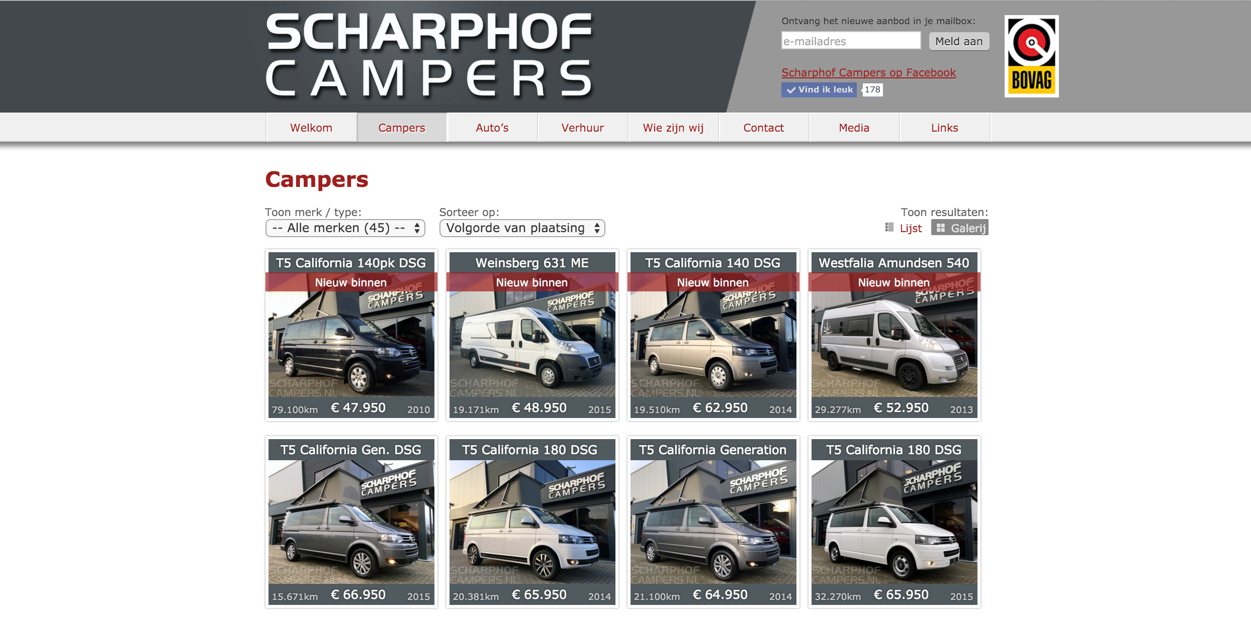
Informatieve website gecombineerd met het actuele tweedehands camper aanbod. De website bestaat uit een WordPress Content Management Systeem (CMS) met custom Responsive AngularJS frontend. Gecombineerd met een backend web applicatie voor het beheer van het actuele camperaanbod. Voor de backend is gebruik gemaakt van Java EE 6, icm Hibernate en Struts 2. Als applicatieserver draait JBoss Wildfly 8.